SXOPE
Healthcare SaaS Platform
Transforming legacy healthcare workflows into a scalable modern SaaS experience.
- Role
- Lead UI/UX Designer
- Domain
- Healthcare
- Type
- Enterprise SaaS Platform
- Status
- Live

Project overview
The business problem
Before SXOPE, the entire workflow depended on manual coordination across disconnected tools.
The old process
01
PCP Office
02
Upload Patient Charts
03
Manager Downloads Files
04
Assign through Email
05
Reviewer Opens Charts
06
Extract ICD Codes in Excel
07
Auditor Reviews
08
Corrections via Email
09
Manager Updates Excel
What broke
Too many manual emails
Multiple Excel sheets
No workflow visibility
Difficult assignment tracking
Duplicate work
Slow turnaround
High operational cost
Frequent human errors
Understanding the users
Stakeholder interviews across roles revealed distinct workflow challenges.
Managers
Overseeing operations
Primary Goals
- Track overall project progress
- Assign charts quickly
- Balance workloads
- Meet deadlines
Pain Points
- “I don't know where the charts are stuck.”
- “Everything depends on Excel.”
- “Following up with emails wastes my day.”
Reviewers
Extracting accurate codes
Primary Goals
- Extract accurate ICD codes efficiently.
Pain Points
- “I constantly switch between Excel and patient charts.”
- “I need two monitors to work.”
- “Finding information takes too much time.”
Auditors
Validating coding quality
Primary Goals
- Validate coding quality.
Pain Points
- “Sending corrections back is confusing.”
- “Tracking revisions is difficult.”
UX Research
Methods used
- Stakeholder interviews
- Workflow mapping
- Contextual observation
- Process analysis
- Usability testing
- Prototype validation
Existing workflow analysis
Multiple disconnected tools. No single source of truth.
- 01
Upload
- 02
Download
Manual friction - 03
Email Assignment
Disconnected - 04
Excel Coding
- 05
Audit
- 06
Email Corrections
High risk Manager Follow-up
Key design challenges
Disconnected workflow
Users switching between multiple applications
No visibility into chart status
Heavy dependency on email communication
Manager workload increased as team size grew
High cognitive load for reviewers
Design goals
Principles focused on reducing complexity rather than digitizing the existing process.
Information architecture
Login
  ↓
Dashboard
  ├── Manager
  ├── Reviewer
  ├── Auditor
  ├── Reports
  ├── Notifications
  └── Settings
Instead of a single generic dashboard, separate workflows for each role reduced clutter and improved task completion.
The solution
Role-based workspaces that replaced Excel, email, and monitor-hopping with one focused screen per person.
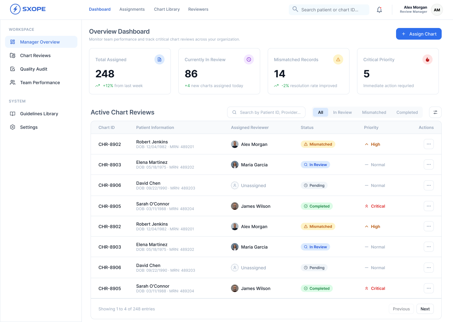
Manager dashboard
Managers now supervise an entire operation from one screen — assignments, workload, live status, and SLAs, all in view.
- Bulk assignment
- Team workload
- Live status tracking
- Pending, completed, mismatched charts
- Performance metrics
- SLA tracking
- Notifications
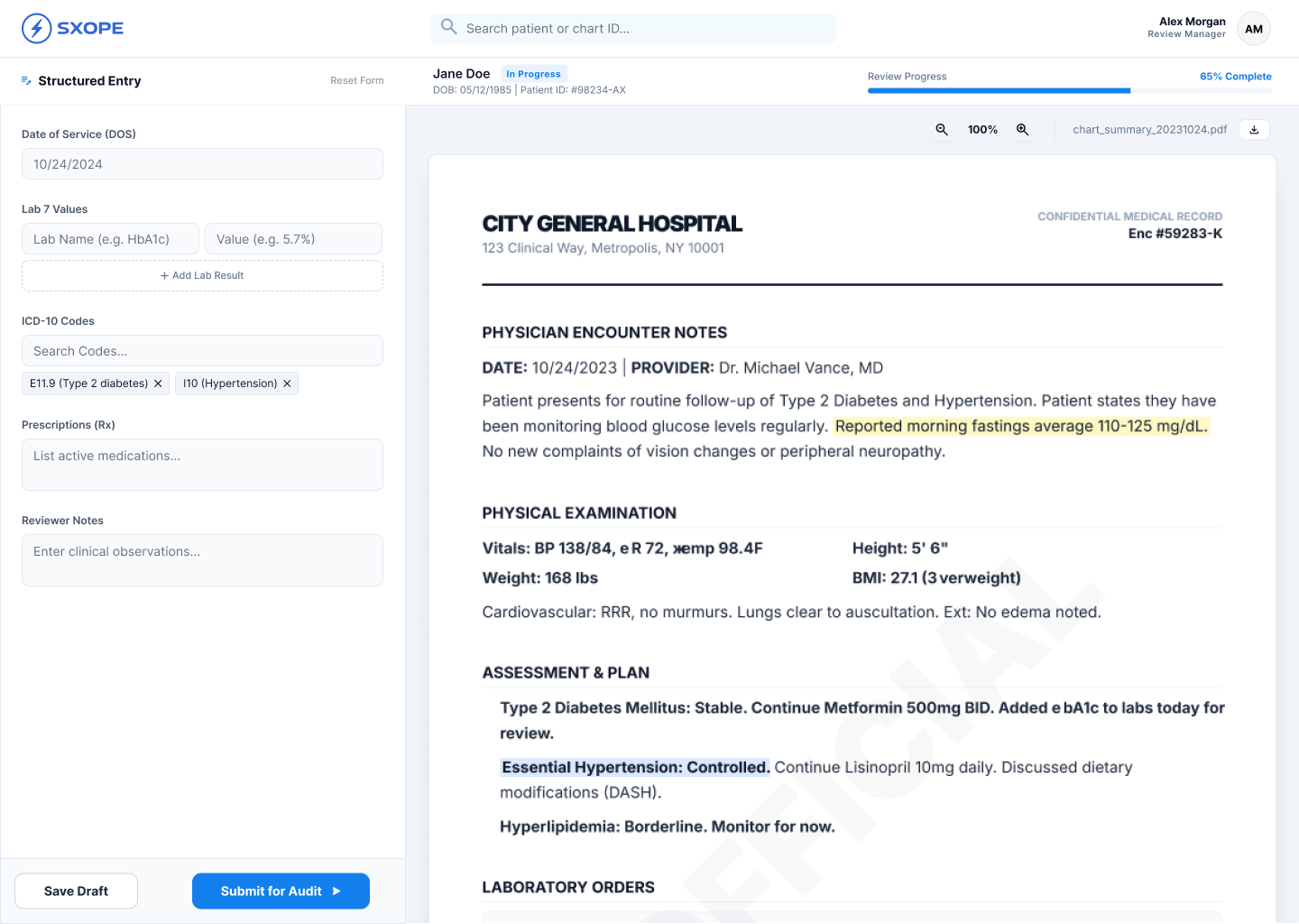
Reviewer workspace
Excel ↔ Chart. Two monitors, multiple windows, constant switching.
Left
Patient details, DOS, labs, ICD, meds, notes.
Right
Medical chart viewer.
- Less scrolling
- Fewer clicks
- Better concentration
- Faster coding
- Lower mental effort
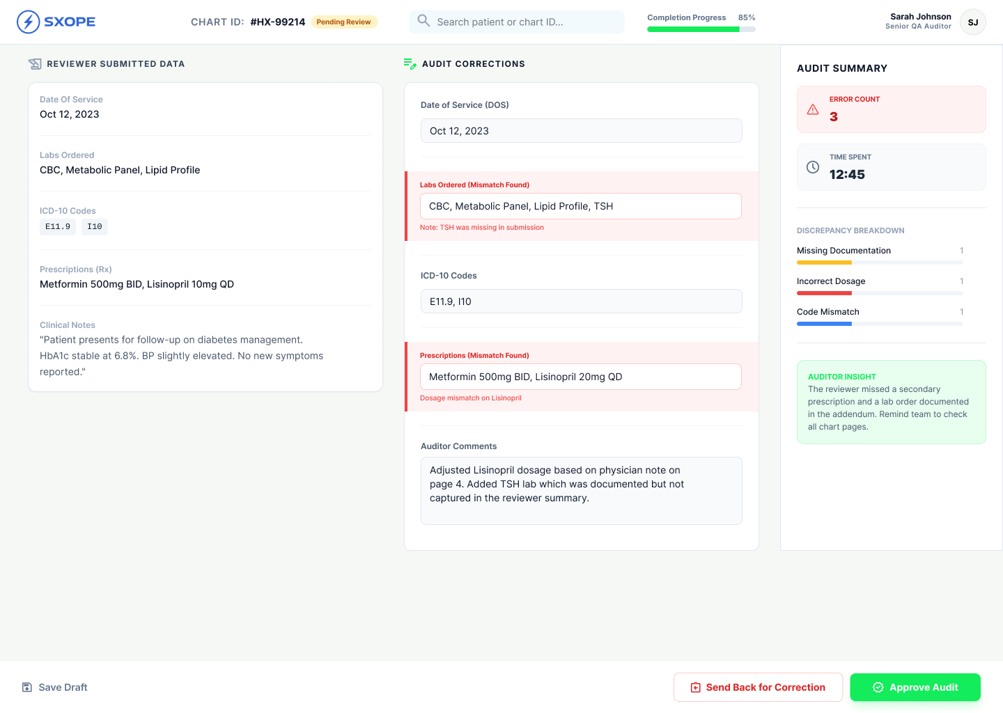
Auditor workspace
- Difference highlighting
- One-click Approve
- Send Back
- Comments
- Validation status
- Audit history
The review cycle became significantly simpler.
Notifications
System automatically informs users about:
Smart filters
No more manual searching.
Dashboard metrics
LiveCharts assigned
Charts pending
Completed
Rejected
Returned
Reviewer performance
Auditor performance
Turnaround time
Design process
Discover
Interview users, understand workflow.
Define
Pain points and business goals.
Ideate
Workflow redesign, role-based dashboards.
Prototype
Low-fi, high-fi, interactive flows.
Test & Launch
Usability testing, rollout, iteration.
My contributions
UX decisions that made the biggest impact
Business impact
- ~5,000 patients processed
- Heavy email dependency
- Manual tracking
- Limited scalability
- ~250,000 patients processed
- 40-member teams managed by a single operations manager
- Minimal email communication
- Centralized workflow
- Improved transparency
- Faster chart review
- Reduced operational effort
Operational efficiency
↑ Significant increase in processing capacity
Productivity
↑ Managers handle larger teams
User satisfaction
↑ Simpler workflows
Error reduction
↓ Fewer manual mistakes
Visibility
↑ Real-time workflow tracking
What I learned
Great UX is not about creating beautiful screens — it's about simplifying complex systems. By deeply understanding each user's responsibilities and removing unnecessary decisions, we transformed a fragmented, email-driven workflow into a scalable enterprise platform. The biggest success wasn't automation alone; it was designing an experience that naturally guided users through their tasks, reduced cognitive load, and enabled the organization to grow from processing 5,000 to 250,000 patient charts efficiently.
Why this case study stands out
This project showcases end-to-end product thinking beyond interface design. It demonstrates how user research, workflow analysis, information architecture, interaction design, and iterative testing can solve real operational challenges in a complex Healthcare SaaS environment. The measurable business impact — dramatically increasing throughput while simplifying work for managers, reviewers, and auditors — highlights the value of UX as a strategic driver of business outcomes rather than just visual design.
View the Figma
SXOPE — full design file
figma.com/design/veM8jD0S62tJ0x19NSPCns/sxope-project
Selected screens
Want the full walkthrough?